epi

Enlightened Path Enstitute

Stationary

mockups-design.com

I didn’t want the front to be interesting while the other pages received no attention, but I also didn’t want to add so much that it would feel disrespectful to the knowledge taught through Islam and EPI. So I played with the background color and added small arrows pointing to each subheading, resulting in one of my best pamphlet designs.

Among the things I had to do for EPI Mosque, I was asked to make a pamphlet (trifold). I designed it to be serious yet unique in its own way. The front is composed of a group of hexagons, each containing part of the image of the “path to the light of Islam,” curved by the EPI (Enlightened Path Institute) mosque.

Signage

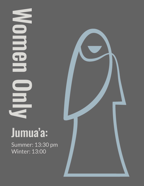
As people can get confused between doors when there are too many, I had to create a “Women Only” sign. The dark background and light blue figure were intentional, contrasting with the white walls to attract attention to the restriction.

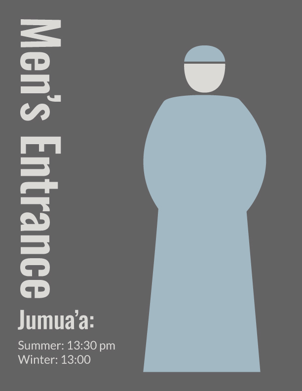
The difference between “Women Only” and “Men’s Entrance” is intentional: young girls can use that door if they need to get something from their father, so it is labeled as an entrance to allow easier access to their parents.

Although the walls are also white where the toilets are, they aren’t something people usually want to focus on. Instead, they should be visible when you’re looking for them and unobtrusive when you’re not.

I intentionally decided to make the male and female figures on the toilets different for two reasons: first, to keep them unobtrusive, and second, to show that the institution is open to everyone—you don’t need to wear a specific set of clothes to learn your religion or to pray.