Arabiste

The Evolution of Middle Eastern Art

For this school project, I was asked to create a full branding concept from scratch, but unlike many of my classmates who designed existing products, I wanted to create something completely original. That’s how Arabiste was born: a fusion of traditional Middle Eastern geometric art with neon lights and phosphorescent materials. My goal was to take intricate, timeless patterns and reimagine them as modern, luminous pieces that come alive through movement, especially rotational motion.

This blend of heritage, light, and motion forms the foundation of a new art style—innovative yet honoring the elegance of Middle Eastern design. By taking this unconventional approach, I aimed to set my work apart, creating a brand and art form that didn’t exist before.

Due to the neon lights and the beautiful geometry of each art piece, I decided to keep the designs constrained to black and white, consistent, and reflective of professionalism and the ability to work with minimal colors. That wasn’t the only reason for choosing black and white; this is a new, revolutionary art that ties together the broken relationship between ancient and modern art forms, while remaining conscious of the environment through the use of eco-friendly materials in both the products and packaging.

Since I did not want the packaging to steal any attention away from the designs when presented together, and I also did not want people to think that this art is unattractive without neon lights, I decided to make it minimal yet classy, to show that it remains art whether in motion or still, whether lit up or not.

Minimal doesn’t mean boring; it only means space, and reusing elements everywhere without giving each design a separate identity. That is my opinion, at least. For the brand’s contact materials, I designed a complete stationery set that reflects Arabiste’s unique artistic identity while keeping it minimal. I began with the business card, giving one side a strong visual impact by featuring the Arabiste icon alongside a brief description: “Cyber Traditional Islamic Art.”

The shape on the card, the contrast of the icon between the inside and outside of the envelope, and the subtle use of space on the letter page—all together create a cohesive and striking design that feels minimal yet powerful.

Logo Black & White

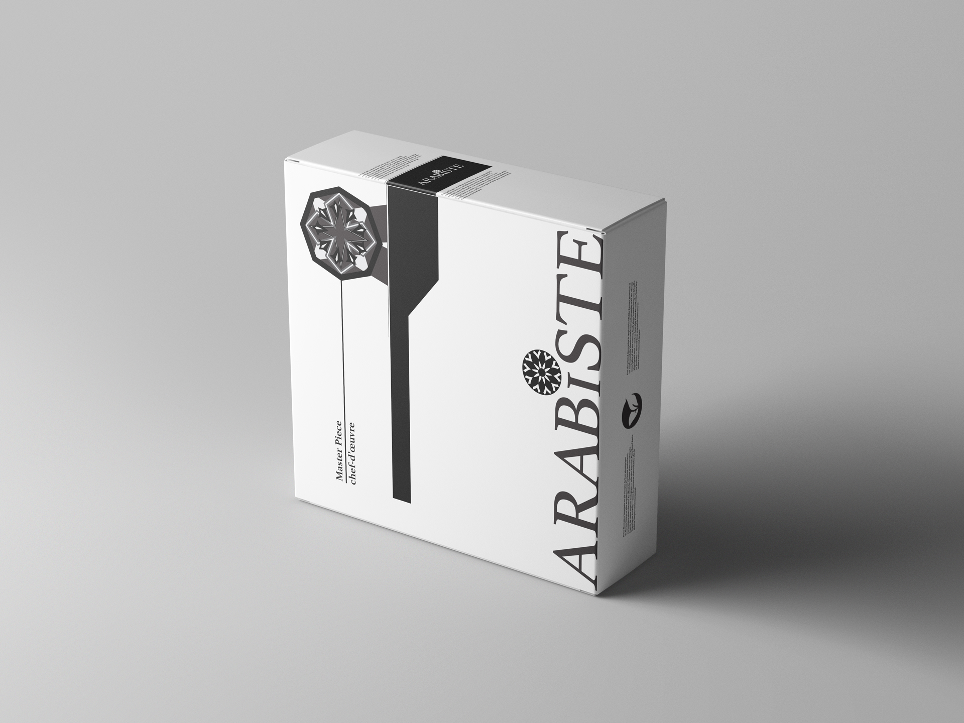
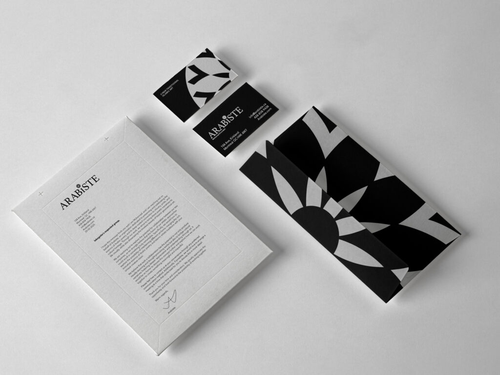
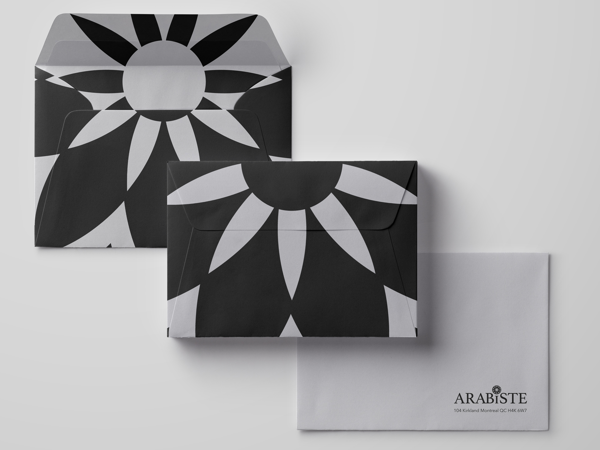
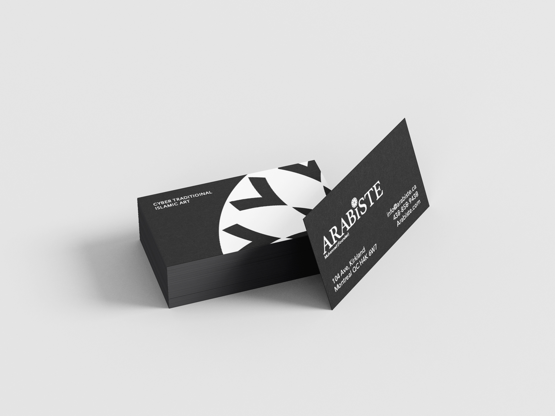
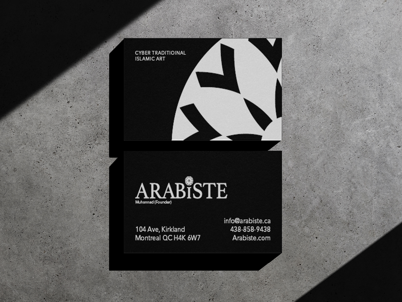
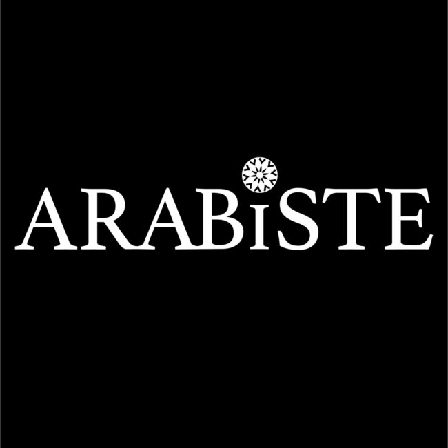
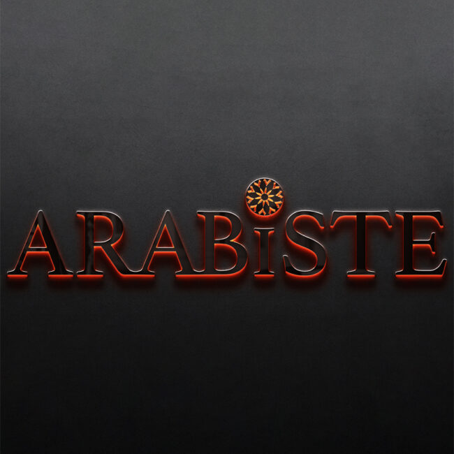
For this logo, I decided that a sans-serif font would not be optimal. Although contrasting the icon with the font is what people would usually think of, in this case the company’s revolutionary, strong, and cultural designs call for a strong serif that reflects its nature.

Logo Mockup

Since the company’s designs are all lit up, I decided to make the logo itself shine. In this mockup, you can see the icon on top of the shortened “I” taking its place and standing out as if it’s on the throne compared to every other art.

some more Arabiste animations